5 UX Myths to Consider When Planning Your Next Association Website

Every new website project is different and exciting as a User eXperience (UX) designer; however, there are several common characteristics shared by every project.
In this article, we will review the five biggest myths of so-called “good” web design and discuss how processes have changed and improved over the last few years.
Before we dive into UX myths we should first define what UX means. A simple explanation of User eXperience design is an approach to design that focuses on understanding the needs, wants and behaviours of users.
The goal of UX design is to eliminate personal bias and create interactions designed to solve a user’s needs. When done right, UX design considers variable user actions and makes sure that no aspect of the experience is unintentional.
Myth #1: People Don’t Scroll
We’ve heard this far too often when planning websites for member organizations. It’s a fair comment, because back in the early days of the internet users weren’t used to scrolling, so this was a genuine concern. It prompted the rise of the “scroll icon” trend that would appear above the fold to let users know they can scroll down the page.
According to UXMyths, current research finds that people do scroll. We can all breathe easy knowing that almost all users scroll down instinctively, regardless of how they are cued to do so. You can see a good example on the Canadian Public Relations Society website, which uses scrolling to divide and separate information on the homepage into digestible sections, versus cramming everything above the fold.
Myth #2: Accessible Sites are Limited in Design Possibilities
By 2025, Ontario will make it mandatory for websites to be AODA compliant, which means associations should be planning for the future now and designing for accessibly compliance today. With this comes a misconception that to be compliant, the design must be plain and boring, restricting colours to black and white to ensure proper contrast. This was true when sites first started being accessible.
In the early days of accessibility, websites were being stripped of design in favour of accessibility. However, as we have continued to develop our understanding and abilities, we’ve also been able to integrate good design into fully accessible sites.
Some great examples are:
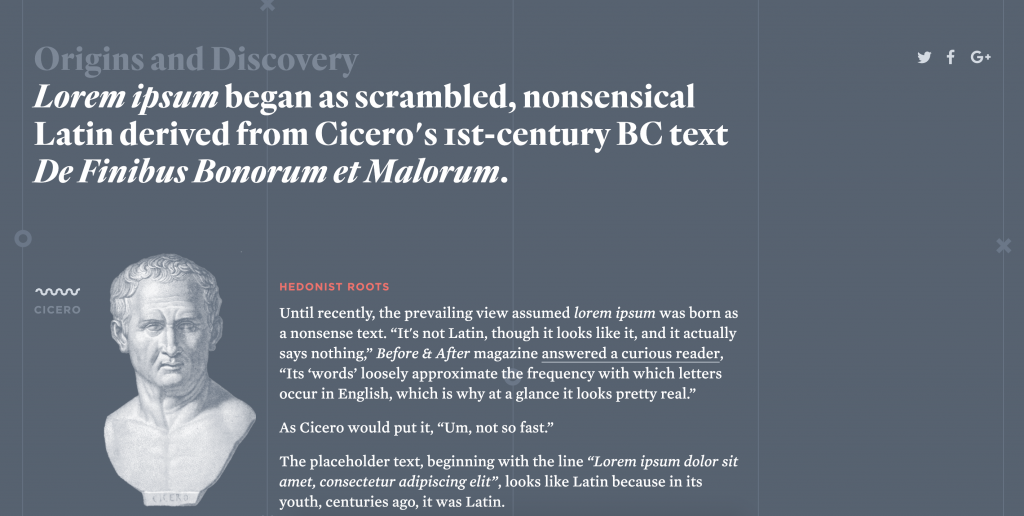
Myth #3: You Can Design a Website Without Content
Website design is about fast turnaround and templated builds that can adapt and grow with various types of content. This means websites are being designed using placeholder content (lorem ipsum) and optimal layouts instead of real content. This method is kind of like putting the cart before the horse; it’s great for moving quickly at the start of a process, but it eventually catches up with you down the road when you have to adapt and redesign elements because of unplanned content.
The fact is that users come to websites for great content, not the beautiful design. It’s important for it to look good, but if the content doesn’t come through in a clear and concise manner it hurts the overall usability of the website.
Myth #4: Users Make Optimal Choices
Research has shown that web users don’t make the optimal choice when browsing through your site. In a perfect world a user would come to your site, read the page and accurately navigate to the information they need.
However, research has shown that users tend to have the mindset of “good enough” when trying to find information on a website. They are okay with quickly clicking links and going back if they are wrong, versus reading thoroughly and navigating only once. It is easy for visitors to use trial and error when browsing since there is no punishment for clicking on the wrong link, outside of lost time.
https://www.smashingmagazine.com/2007/10/30-usability-issues-to-be-aware-of/
Dietitians of Canada is a great example of how to ensure users have easy access to menus and breadcrumbs that will allow them to navigate forwards and backwards through the site. It has clear breadcrumbs at the top of every page and easy-to-read navigation that can be quickly scanned and clicked through.

Myth #5: 3-Click Rule
This is a rule that came about in the early stages of UX: everyone had the idea that you needed to be able to navigate to any information within three clicks, or you would lose the user. With research, we have been able to debunk this myth and learn that the number of clicks it takes doesn’t change the user’s satisfaction with the website. What’s really important is having a logical structure and easy-to-follow site hierarchy. Ten clicks through a well-planned site hierarchy is better than three clicks through a poor one.
https://www.nngroup.com/articles/3-click-rule/
Drug Access Canada shows us the importance of having a strong structural hierarchy to the site versus having less clicks. The Resource page uses multiple clicks to sort through the information the user is looking for in a clear and concise format. This ensures that the extra clicks won’t affect a consumer’s journey, since they can easily find information.

About the Author